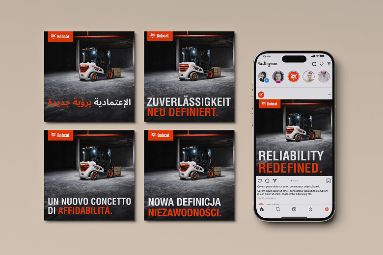
bobcat

  • International Coverage
  • Rebranding

BObcat MATERIAL
HANDLING REBRAND

A Big Step Without Losing Trust

THE CHALLENGE

Brief
& goals

Bobcat decided to sell its Material Handling line and Portable Power products under the Bobcat brand instead of Doosan in EMEA markets. The product and dealer network stayed the same, but the badge and colour changed.

Our job? Explain the change clearly and protect customer trust with messages that matter to local markets and dealers, and avoid a hard rebrand that would make the Doosan-branded machines that were still in stock at the time of rebranding a difficult sell.

our approach

Start AT HOME,
Listen to
Markets

Before making assets, we spoke with internals, dealers and local teams to learn what customers ask first: Will service change? Are parts and warranties the same? Is it still the machine I know? Is Bobcat as good as Doosan? Those insights shaped everything.

Messaging

“Name changes. Reliability stays. Same machines, same service, same people — now under Bobcat.”

Animation as
explanation

A simple 3D “laser sweep” turns Doosan orange to Bobcat white and switches the logo. One clear visual that says “rebrand only.”

Human
proof

We created a customer testimonial video in the German port of Bremerhaven to show real users putting Bobcat forklifts to use and confirming continuity.

THE SYSTEM

Built to Travel
Across Markets

We turned the core story into a market toolkit: 
copy (FAQs, headlines, captions), language variants, and usage notes that local teams could tune 
to local needs (dealer structure, service info, regulatory details). Consistent idea, 
locally credible.

When the system was in place, it was time to go to customers and ask what they really think.


THE IMPACT

Why it
Worked

We led with dealer insight and answered the real questions buyers have. The animation showed the change in one glance; the testimonials made it believable. Keeping the message simple helped local teams adapt it quickly and explain it in everyday conversations.

In a space of just weeks, we created a clear and actionable rebranding strategy & functional media plan with a focus on key EU markets.

Dealers had a clear, trusted script and visual to explain 
the rebrand.

Customers understood it was a logo/colour change 
only — no downgrades in product quality or support.

Rollout moved smoothly across markets, with a consistent story and local relevance.

OUR TAKEAWAY

For sensitive B2B rebrands, focus on the people and customer needs. Take the time to get in-depth market insight, then say exactly what stays the same, and show it. And when there are credible, tangible benefits that the new brand brings, drive that message home. 
Don’t just make marketing promises: let real customers confirm what you claim — on camera.

Contact Us

LET'S DO SOMETHING BIG TOGETHER

New projects, old projects, careers, press and other inquiries — reach out to us with anything.

Thank you

Maybe something interesting will grow!